Portfolio, 2026 · Toronto

aghighgohari@gmail.com Instagram LinkedIn

Aqiq Gohariعقیق گوهری

Graphic designer working in print, type, motion and photography, in English and Persian. I’ve been making images since 2014, from linocuts and posters in Tehran to booklets, films and risograph zines in Toronto.

Graphic Design, OCAD University.
Open to internships and junior design roles.

Booklet and short film, Fall 2025

The Space Heater

Frances Luk wrote a poem called “The Space Heater”. I interviewed Frances about it, then turned the poem into a 12-page booklet and a short film.

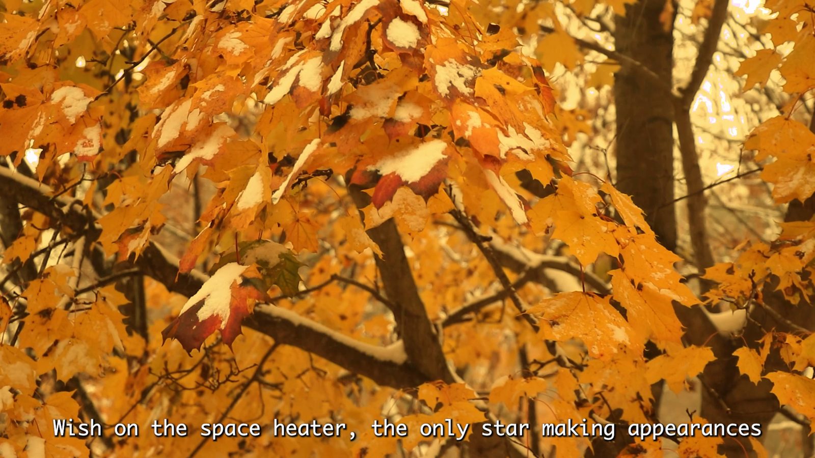
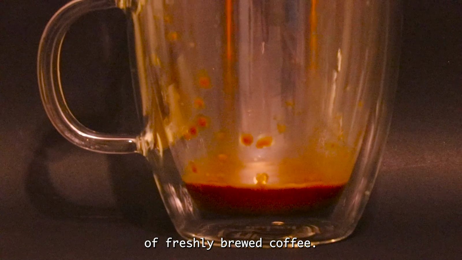
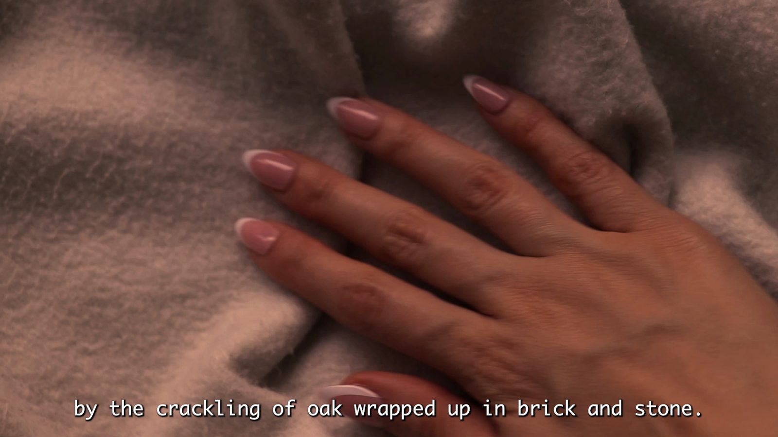
From the film. All footage shot by me.
Context
Graphic Design 1, OCAD University. Instructor Brennan Kelly
My role
Solo project: interview, photography, filming, editing and layout
Format
12 pages, A5, printed and bound. Film, 2 min 27 s, with sound
Type
Nobel, by Tobias Frere-Jones
Poem
“The Space Heater” by Frances Luk
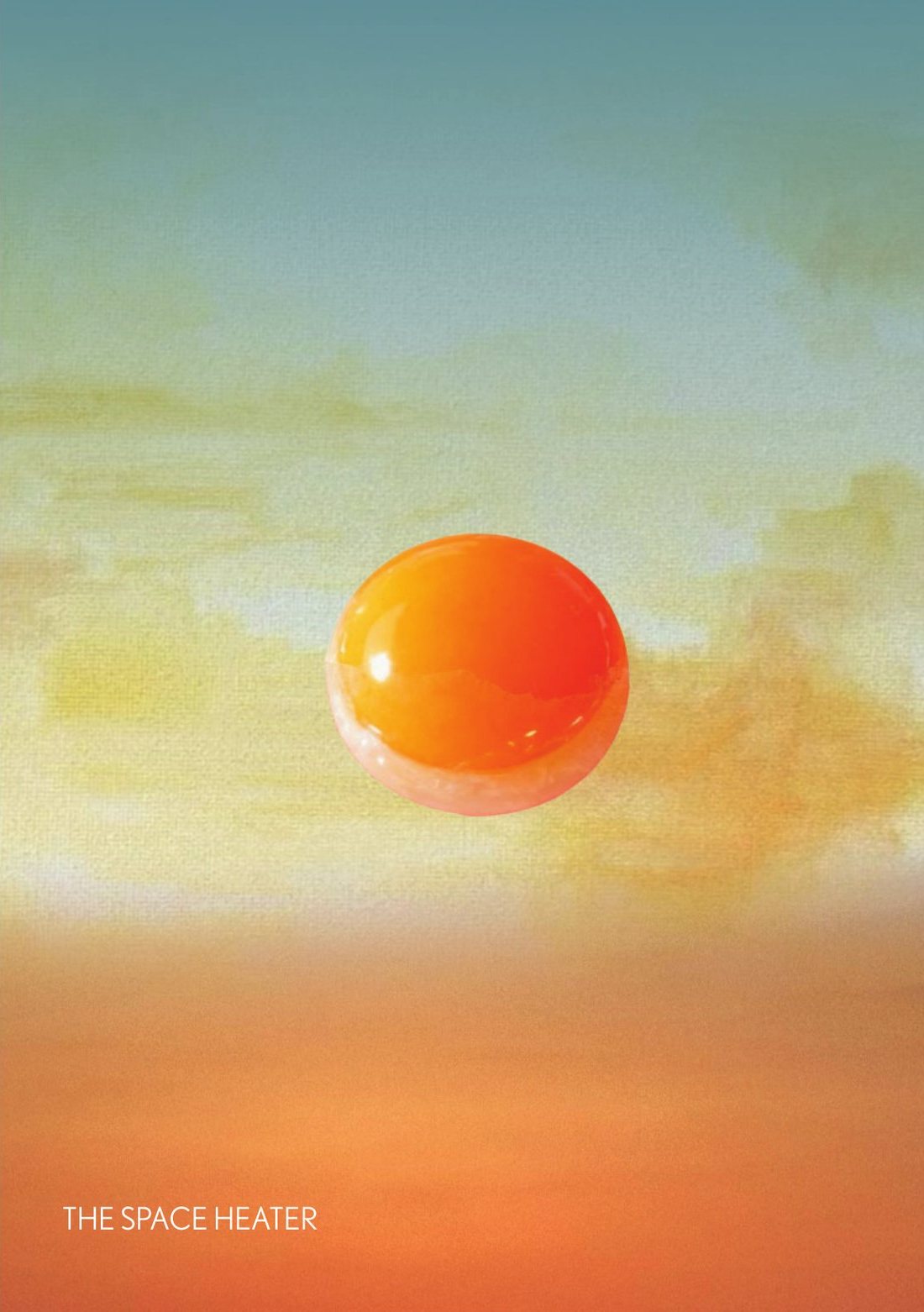
Booklet cover: an orange sun like an egg yolk floating in a blue-to-orange sky, with the title The Space Heater in small type.
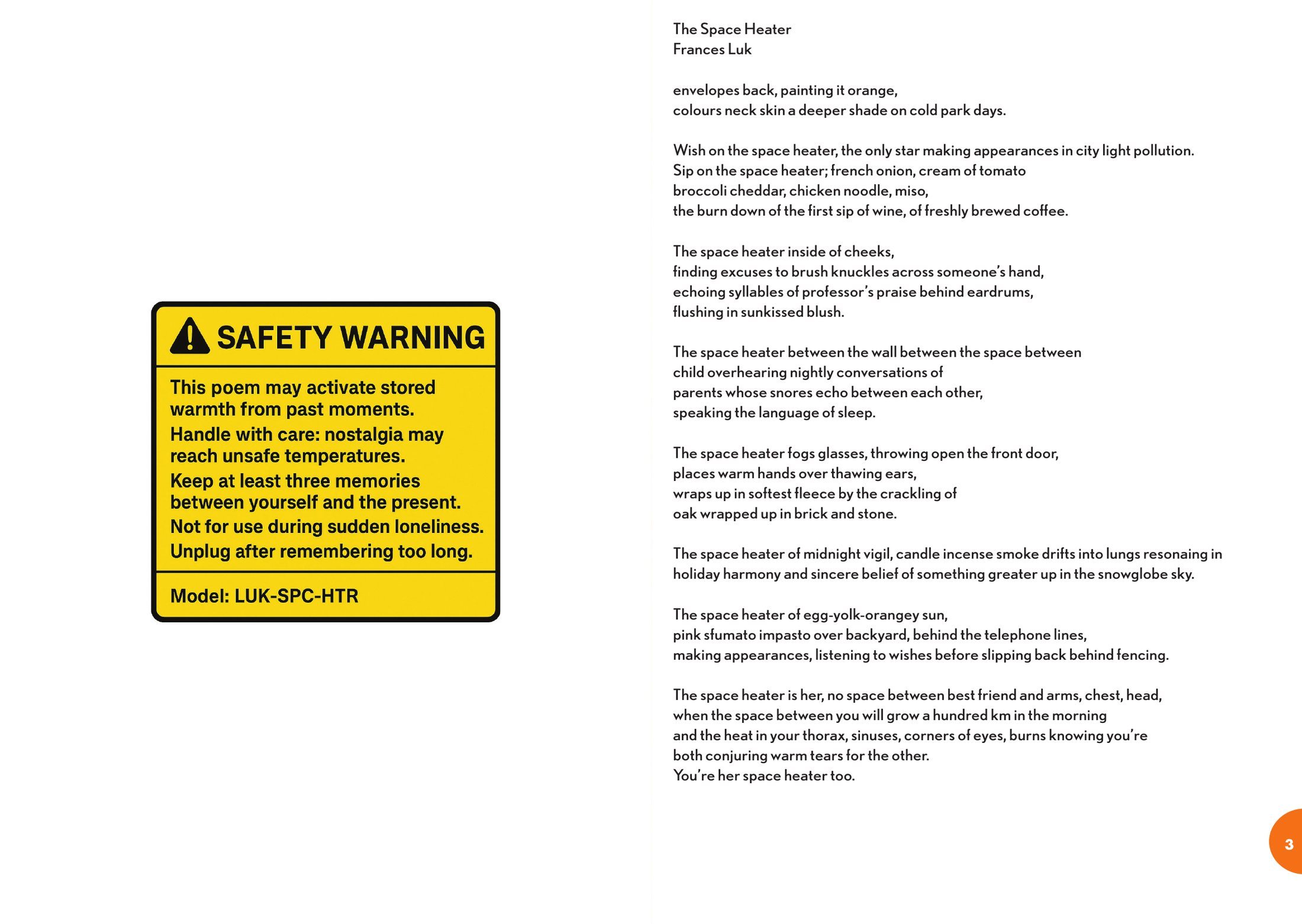
Pages 2 and 3: a yellow safety warning label on the left page and the full poem set in small type on the right page.
Front cover, and pages 2–3: the safety label faces the poem.

I sent Frances an invitation, a consent form and my questions ahead of time, then recorded our conversation. Frances explained that the space heater was never a real object. It stands for the warmth we get from people and memories, so I designed the booklet like an appliance. It opens with a safety label: “Handle with care: nostalgia may reach unsafe temperatures.” The interview runs through the middle pages, over photographs I took for the project.

For the film, I took the look from Frances’s own answers: yellow, saturated, hazy tones, suburban fences and telephone lines. I shot all the footage myself, from soup and coffee to autumn leaves, snow and the view from a plane window. Lines of the poem appear as subtitles, and quick cuts and shallow focus stand in for memories that shift fast.
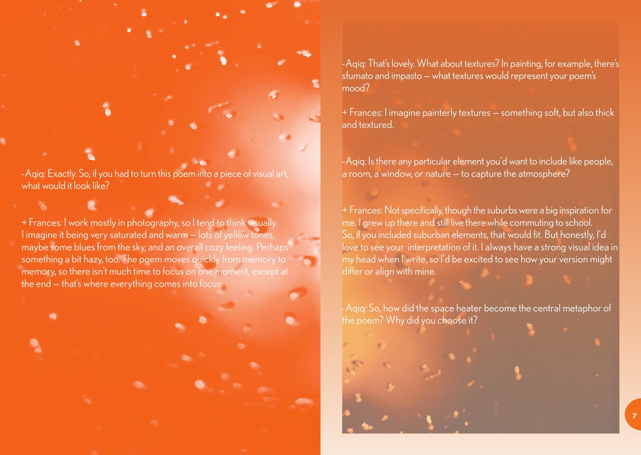
Centre spread, pages 6 and 7: interview text in white over orange photographs of water droplets and soft bokeh lights.
Centre spread, pages 6–7. The interview set over my photographs of rain on glass and out-of-focus lights.
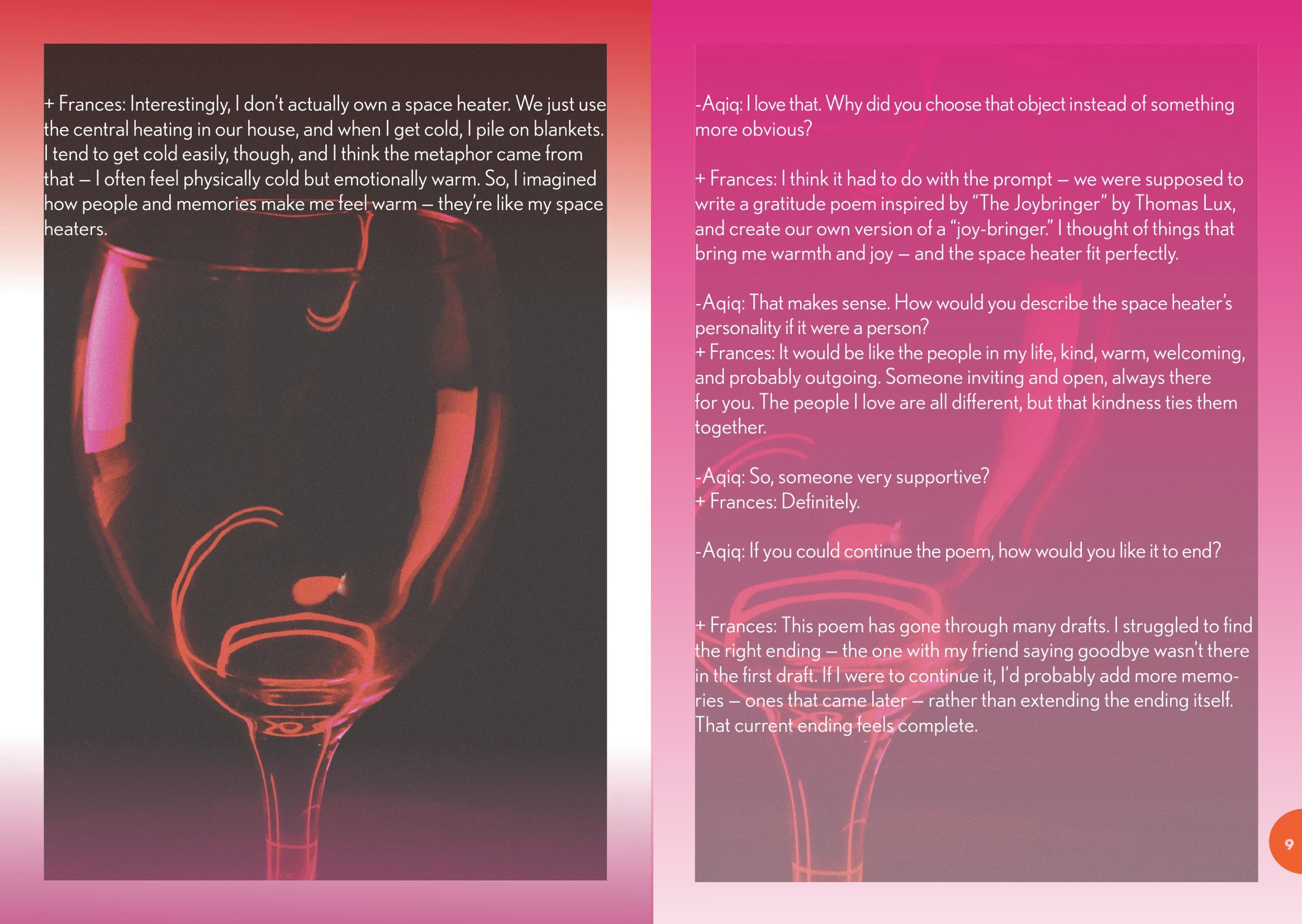
Pages 8 and 9: a wine glass lit in pink and red on a dark background, with interview text over it, and a magenta page of text.
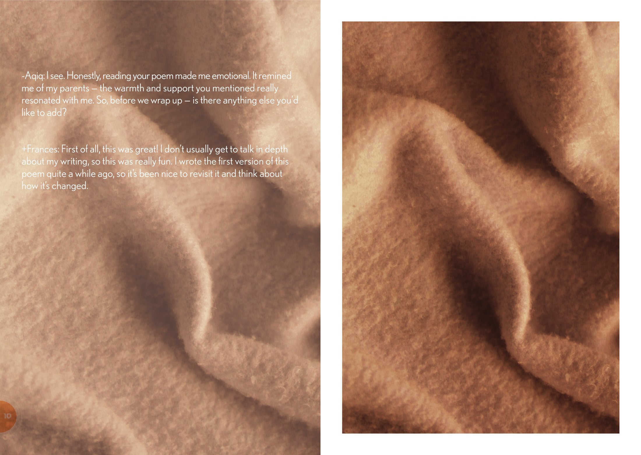
Pages 10 and 11: close photographs of a soft beige blanket, with the last part of the interview over the left page.
Pages 8–9 and 10–11. I photographed the wine glass and the blanket for the booklet.

The Space Heater, short film

2:27, with sound
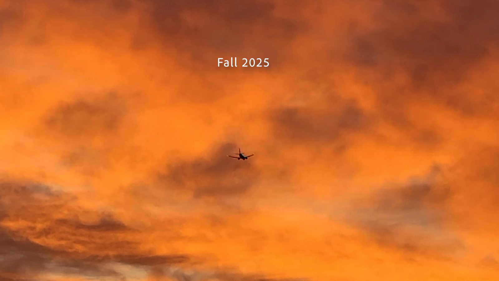
Film still: yellow autumn leaves with a subtitle from the poem. Film still: an almost empty glass coffee mug with the subtitle: of freshly brewed coffee. Film still: a hand resting on a soft blanket with a subtitle from the poem. Film still: an orange sunset sky with a small plane crossing it, and the words Fall 2025.

Stills from the film.

Two-colour risograph, Winter 2026

Woven Symbols

A bilingual zine about the symbols woven into Persian rugs, written and set in English and Persian.

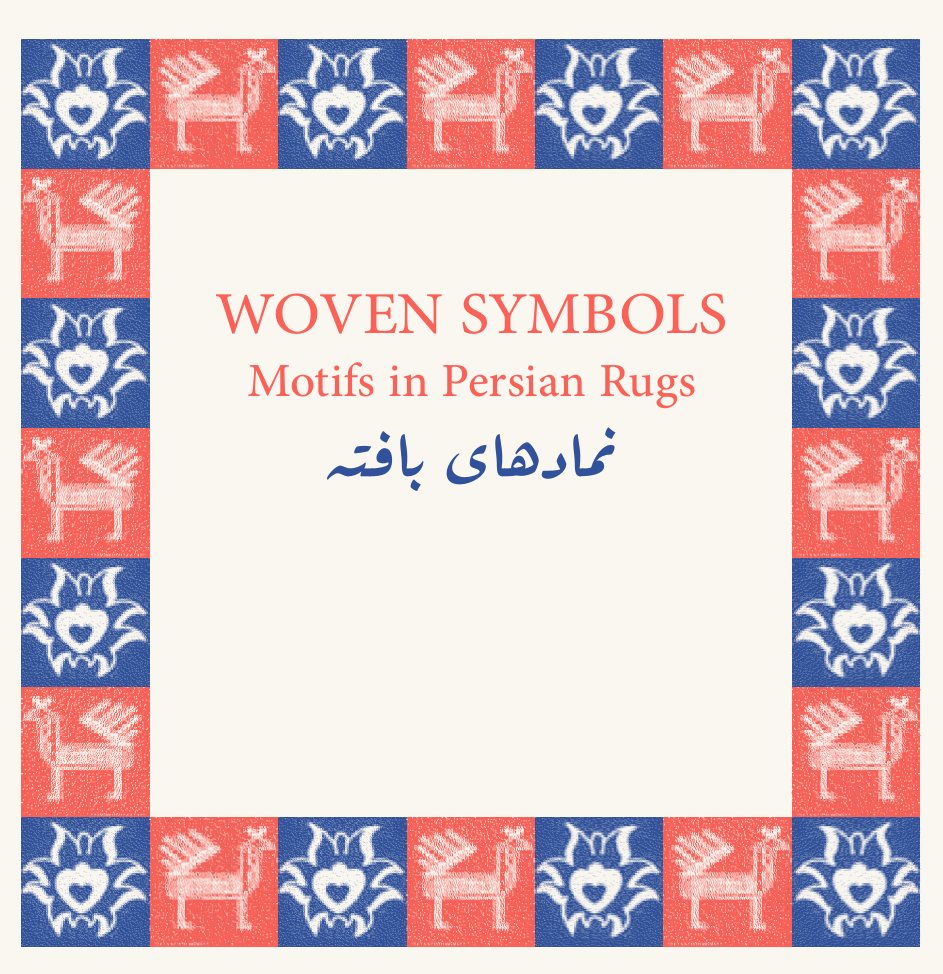
Title panel: Woven Symbols, Motifs in Persian Rugs, with the Persian title below, inside a border of alternating red and blue tiles with camel and bird motifs.
Title panel.

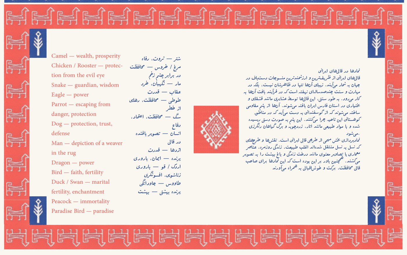
Every motif in a Persian rug carries a meaning. The camel stands for wealth, the rooster protects against the evil eye and the peacock stands for immortality. I set each meaning in English and Persian, side by side, and framed the pages with borders made from rug motifs. The essay looks at rugs woven by the Qashqai and Bakhtiari in Fars Province.

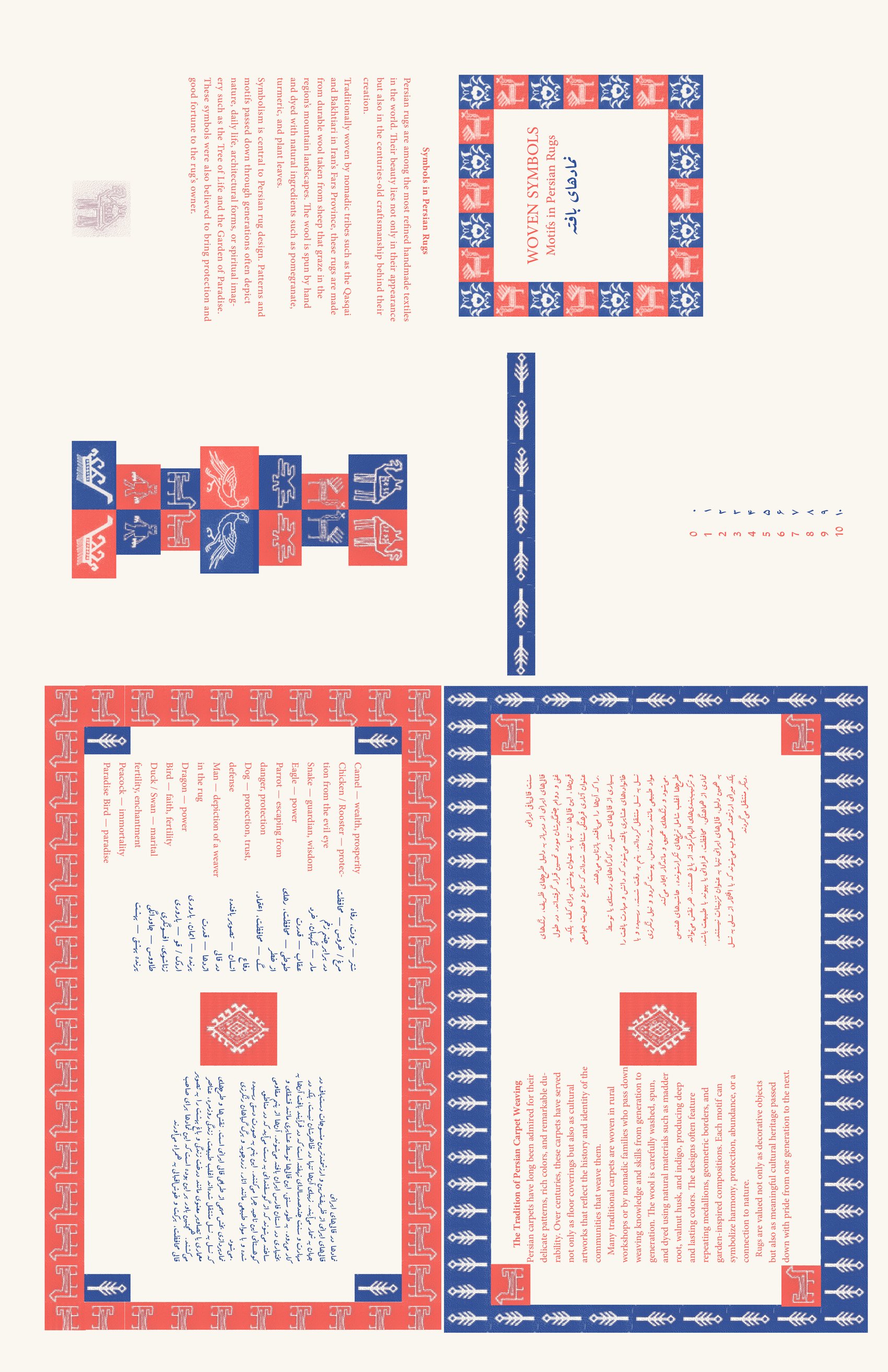
I printed it on a risograph in two inks, Red and Medium Blue, on both sides of a tabloid sheet. The images here are digital proofs made from my print files.

Context
Graphic Design 2, OCAD University
My role
Solo project: research, layout and printing
Printing
Risograph, Red and Medium Blue
Format
11 × 17 in. sheet, both sides
Languages
English and Persian
Panel listing rug motifs and their meanings in English and Persian, such as Camel, wealth and prosperity; Peacock, immortality; Paradise bird, paradise. Framed by a red border.
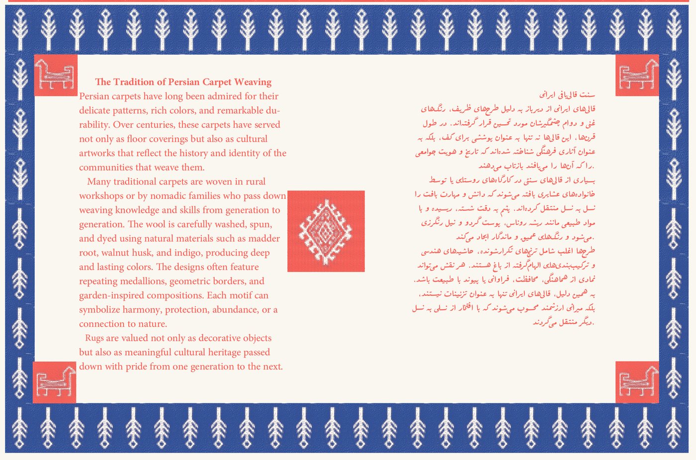
Panel with an essay on the tradition of Persian carpet weaving in English on the left and Persian on the right, framed by a blue border of tree motifs.
The motif key, and the essay on carpet weaving, each in English and Persian.
The full front of the sheet, showing all panels in their printing positions, some rotated.
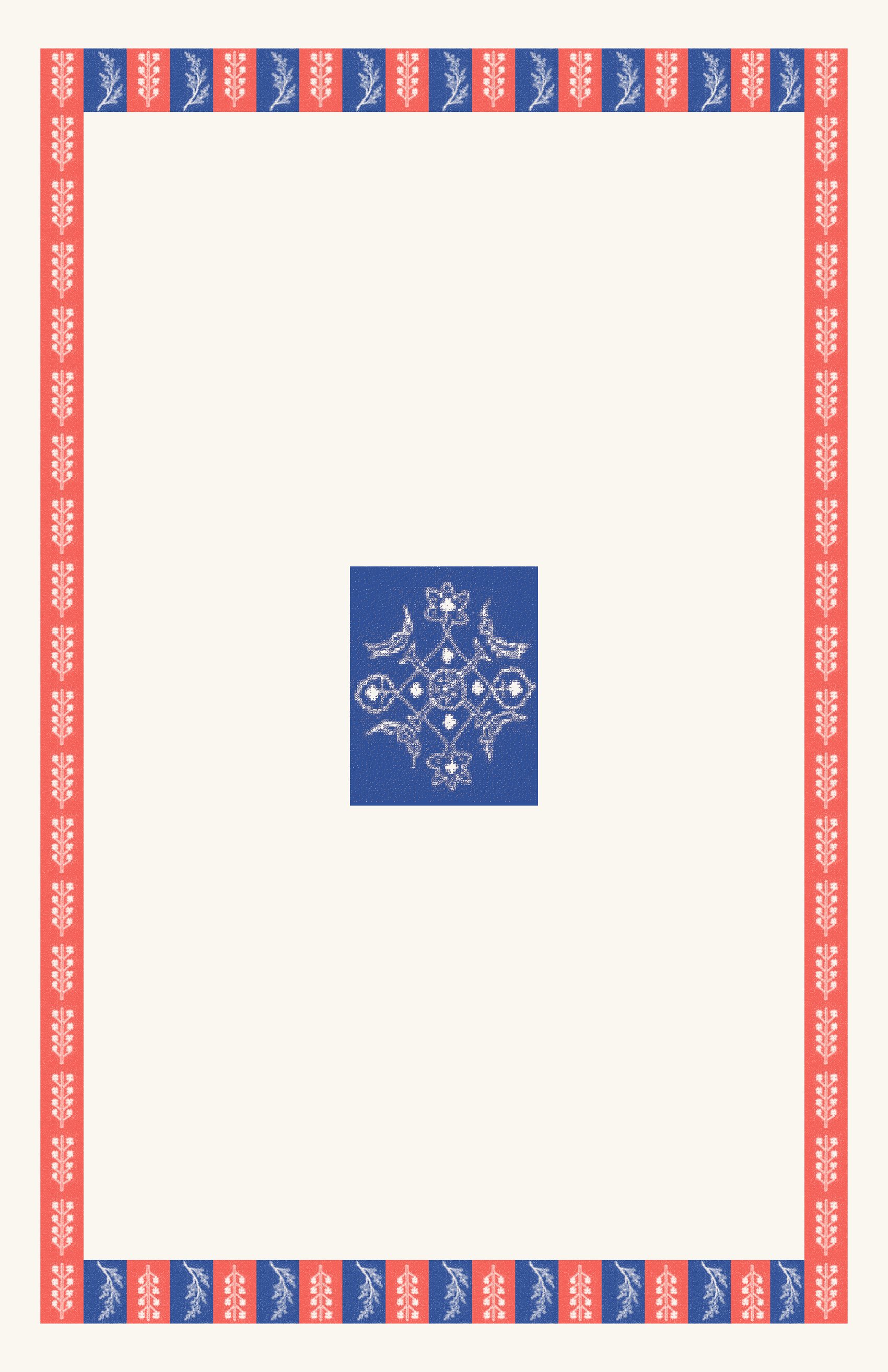
The full back of the sheet: a red and blue border with a single blue medallion in the centre.
Front and back of the sheet, with the panels in their printing positions.

Posters, Tehran, 2019–2020

Persian Type

Typographic posters built from Persian letterforms, made before I came to OCAD.

Scripts
Persian and Latin
Tools
Illustrator, Photoshop

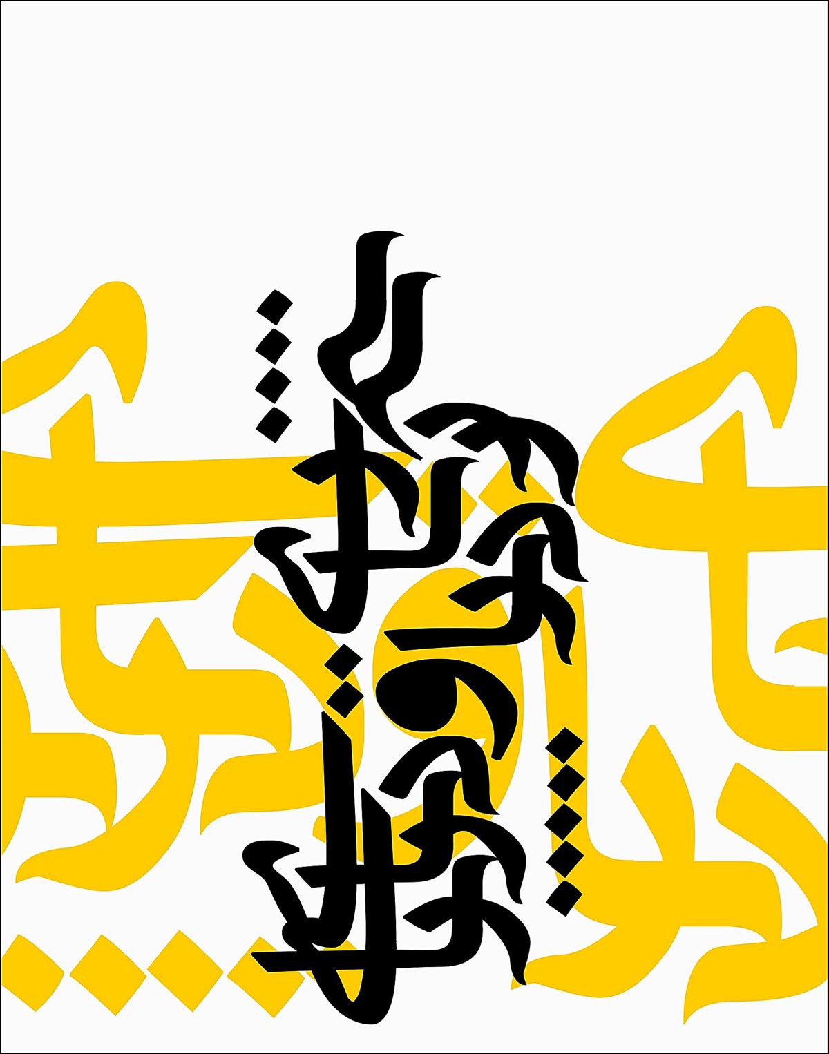
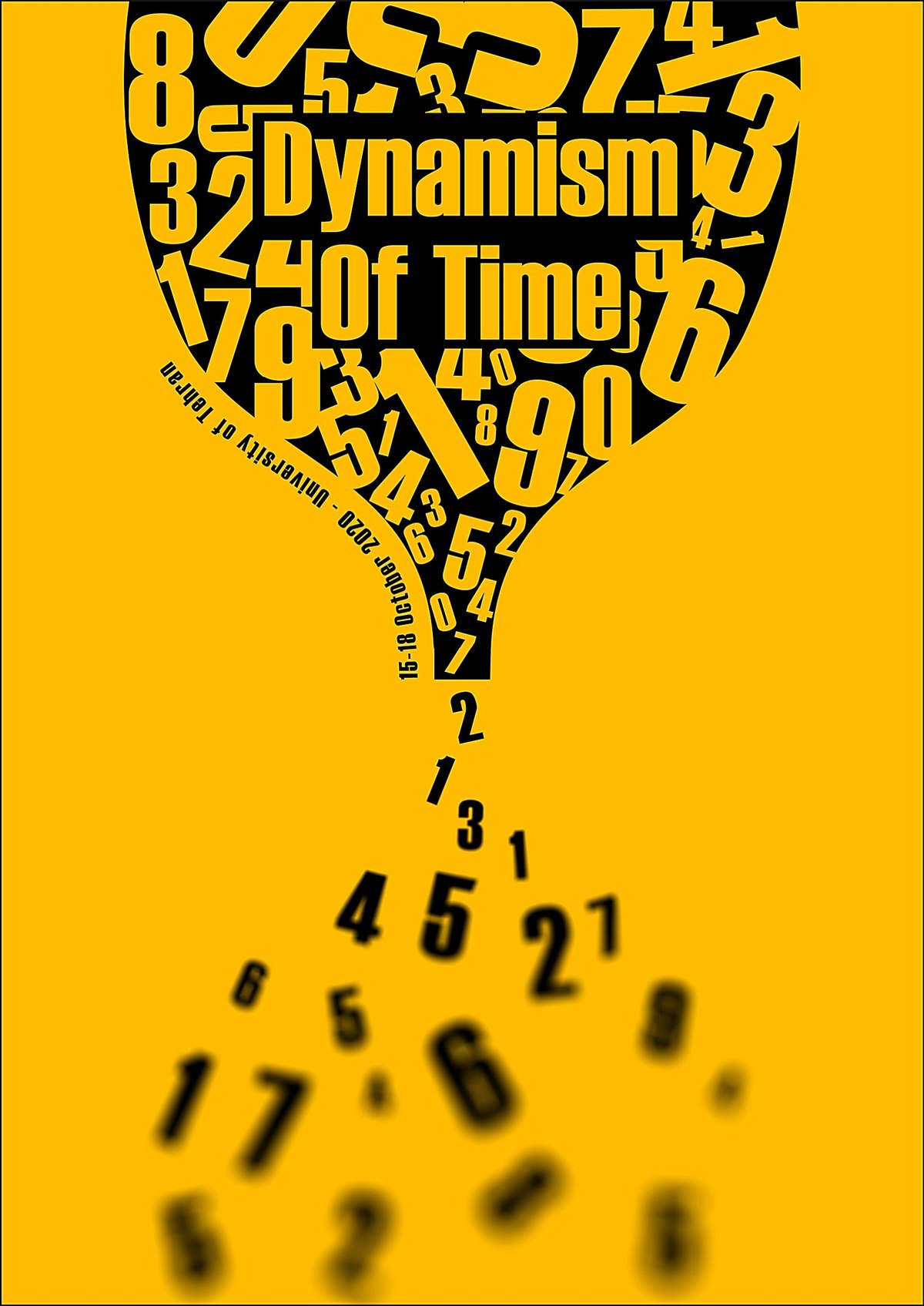
Persian letters can stretch, stack and interlock in ways Latin letters can’t, and these posters lean on that. In Dynamism of Time, numbers pour through an hourglass.

Typographic poster: tall black Persian letters stacked vertically over large yellow Persian letters on white.
Persian typography, 2019
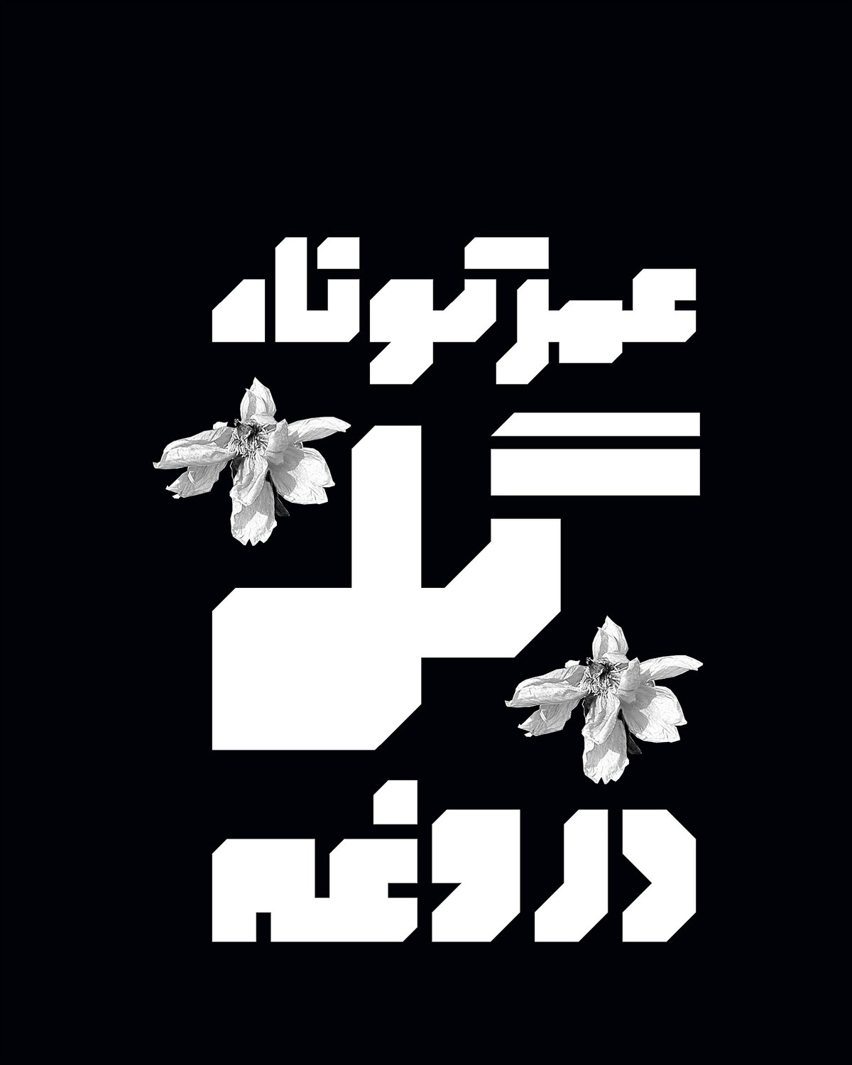
Typographic poster: three lines of heavy white Persian letters on black, with two white flowers.
Persian type, 2019
Poster on yellow: the title Dynamism of Time inside a cup of black numbers that pour down like an hourglass and scatter at the bottom.
Dynamism of Time, 2020
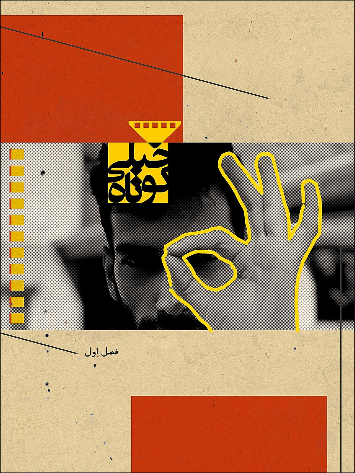
Collage poster on beige paper with red blocks, a black and white photo of a man making an OK sign outlined in yellow, and small Persian text.
Poster for a short film programme, 2019

Logos, Tehran, 2021

Logos

Six marks, from a stack of books to a maze.

Tools
Illustrator
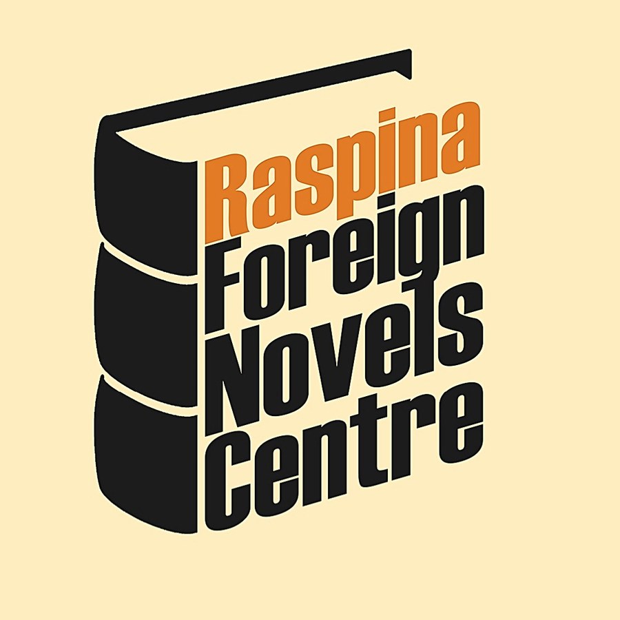
Raspina Foreign Novels Centre logo: the name in condensed black and orange letters set on the spines of a stack of books.
Raspina Foreign Novels Centre
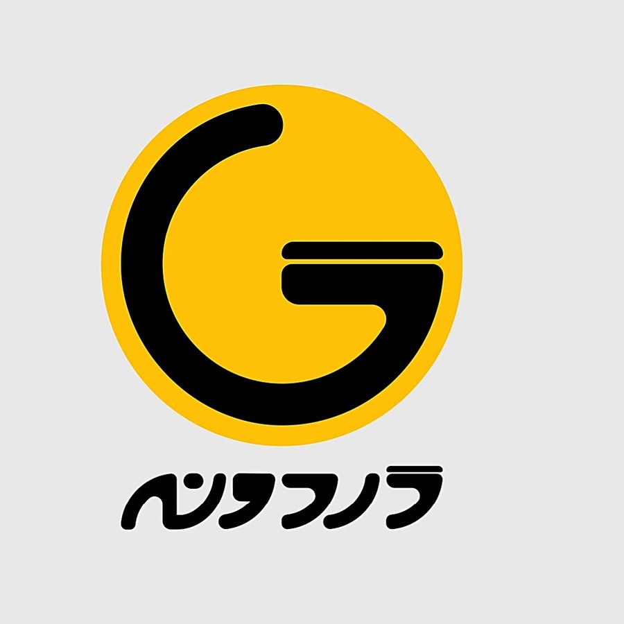
Gardune logo: a black G inside a yellow circle, with the name in Persian below.
Gardune
Artinx.art logo in three versions: a triangle, the letter i and a cross, in black and bright green.
Artinx.art, three versions
Mantra logo: a circular maze inside a black rounded square, with the name in Persian below.
Mantra
Varan Clothing logo: the name in black capitals inside a white bar on black.
Varan Clothing
Aura logo: heavy black letters cut by a thin diagonal white line.
Aura

Exhibition poster, team of five, 2026

The Poem Depot

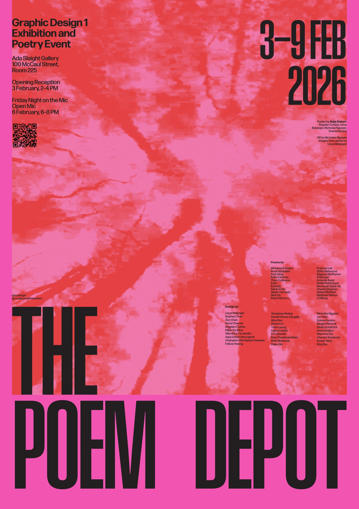
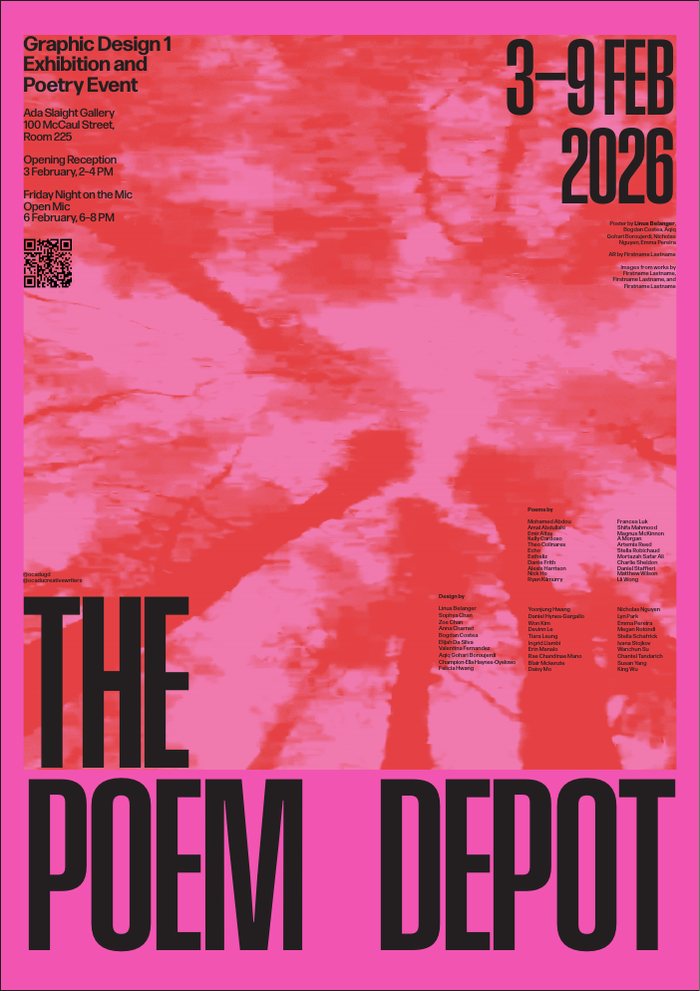
The poster for the Graphic Design 1 exhibition and poetry event at OCAD’s Ada Slaight Gallery, 3–9 February 2026.

Context
Graphic Design 1, OCAD University. Group project
My role
Colour: the pink and red combination on the final poster
Team
Aqiq Gohari, Bogdan Costea, Linus Belanger, Nicholas Nguyen, Emma Pereira
Venue
Ada Slaight Gallery, 100 McCaul St., Toronto
Format
A1 poster, 594 × 841 mm

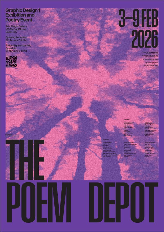
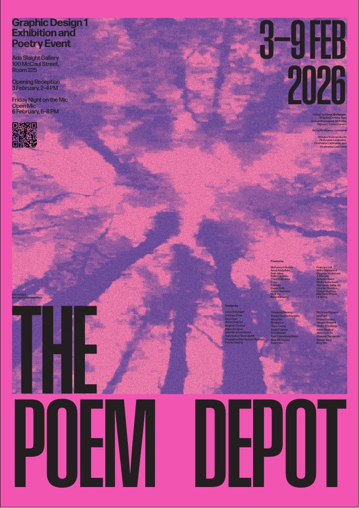
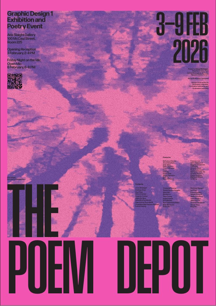
This was a group project. Five of us designed the poster as part of a shared identity for our cohort’s show. My part was the colour: I tried the duotone in several colourways, and the pink and red combination is the one on the final poster.

Credits as printed on the poster: poster by Aqiq Gohari, Bogdan Costea, Linus Belanger, Nicholas Nguyen and Emma Pereira. Images from works by Linus Belanger. AR by Nicholas Nguyen.

The final poster: a pink and red duotone photo of tree trunks seen from below, the event details in small black type at the top, and THE POEM DEPOT in tall condensed black letters at the bottom.
The final poster, A1.
Colourway with a violet border and a violet and pink duotone. Colourway in pink with a violet duotone. Colourway with a violet border and a pink and violet duotone. The chosen colourway: pink with a red duotone.
My colourway studies for the duotone. The last one, pink and red, became the final.

Colour, type and motion, Fall 2025

Same Mistake

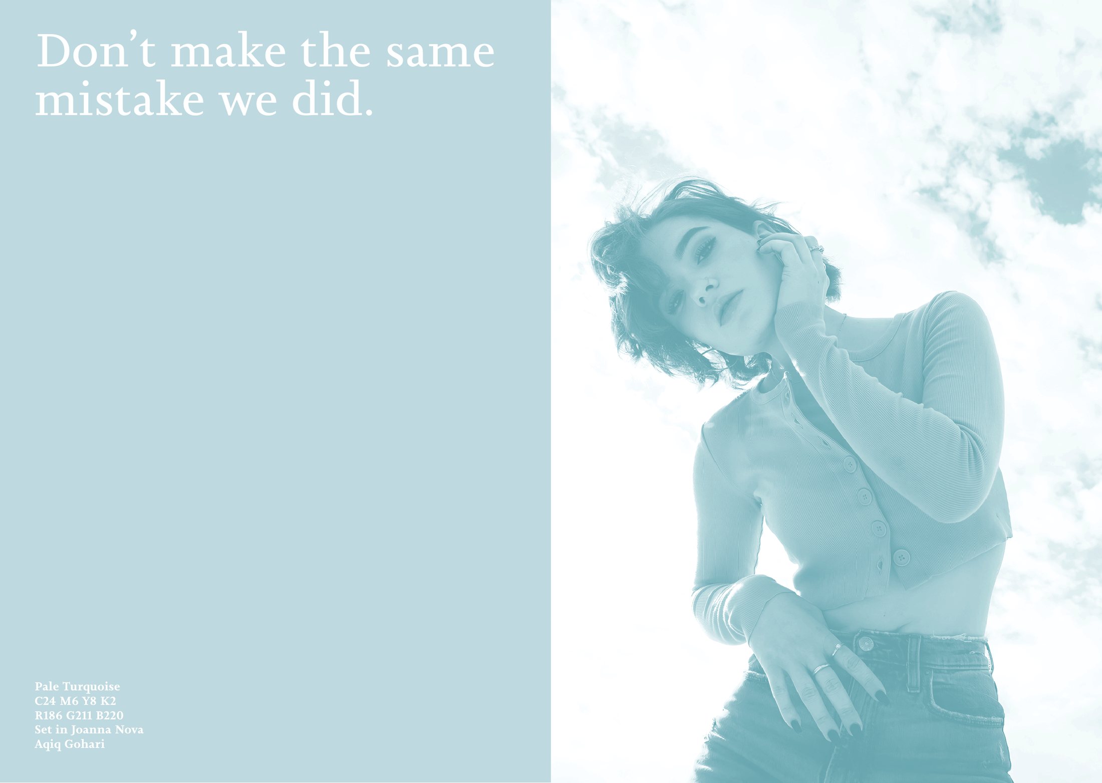
One line, “Don’t make the same mistake we did”, carried through colour, type, motion and film.

Context
Graphic Design 1, OCAD University
My role
Colour matching, layout and motion. Storyboard and performance in the studio film
Colour
Pale turquoise, C24 M6 Y8 K2, R186 G211 B220
Type
Joanna Nova
Tools
InDesign, Photoshop, After Effects

Photo in the spread: an archival image our professor gave us as source material. The studio film was shot by my professor, with me in front of the camera.

Duotone spread in pale turquoise: on the left, the line Don't make the same mistake we did in a light serif; on the right, a photo of a person in a cardigan seen from below against a cloudy sky.
The spread, in the matched pale turquoise. The photo is an archival image from the course.

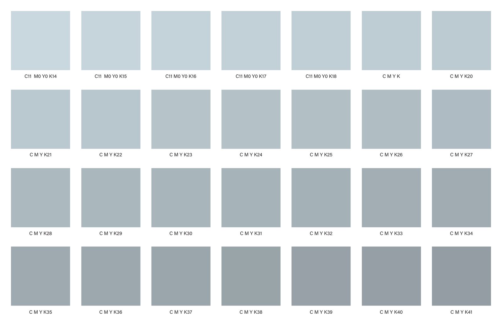
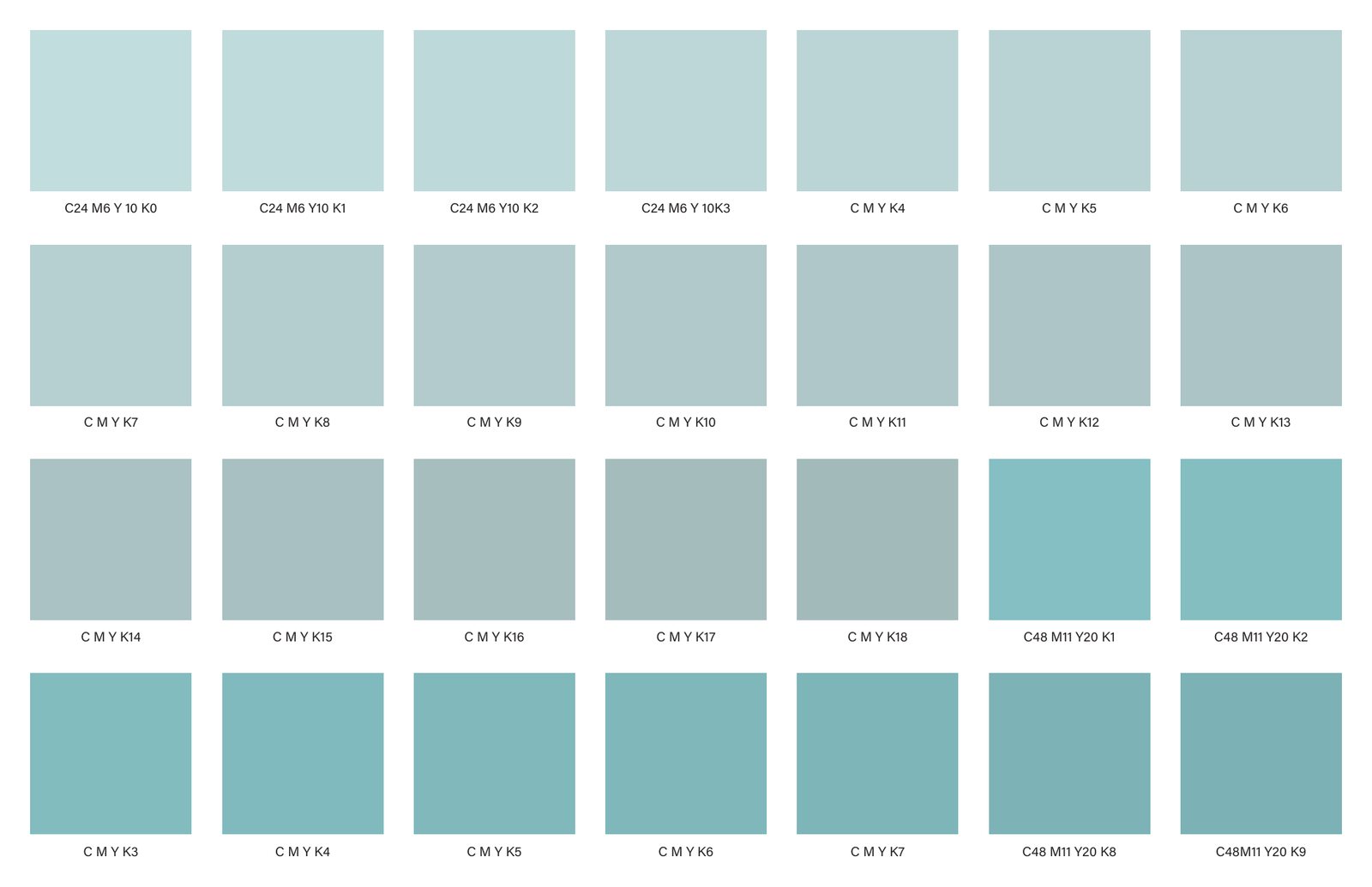
I started by matching one colour, a pale turquoise, printing sheets of CMYK swatches and narrowing them down. The match, C24 M6 Y8 K2, became a duotone spread set in Joanna Nova. The spread was half of a pair; my classmate Stella Schafrick made the other half, which isn’t shown here.

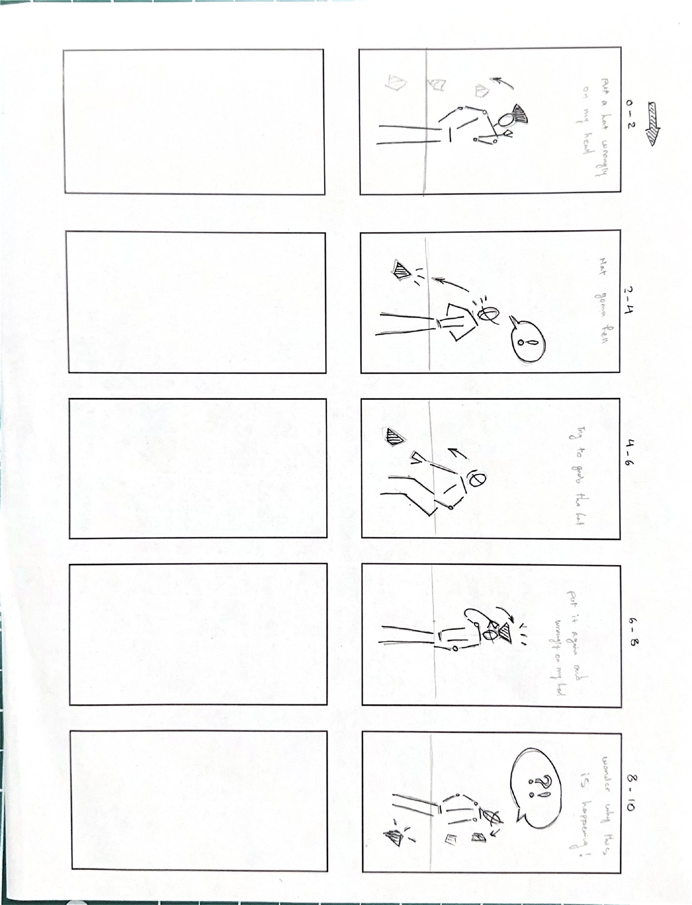
In After Effects the line became a ten-second loop in which “mistake” keeps misspelling itself. A hand-drawn storyboard then became a short studio film.

Kinetic type, ten-second loop.
The studio film, shot from my storyboard. That’s me in the hat; my professor ran the camera.
Hand-drawn storyboard with five frames of a figure and a hat.
The storyboard: a five-frame gag in two-second beats. The hat goes on wrong, flies off, and goes on wrong again.

Photography, printmaking and painting, 2014–2026

Image-making

I make many of the images in my projects myself: photographs, prints and paintings.

Photography
Canon DSLR, studio and street
Printmaking
Linocut, woodcut, screen print, risograph
Painting
Acrylic, coloured pencil
Folded paper form glowing violet under a coloured gel on a dark blue background.
Paper, violet gel
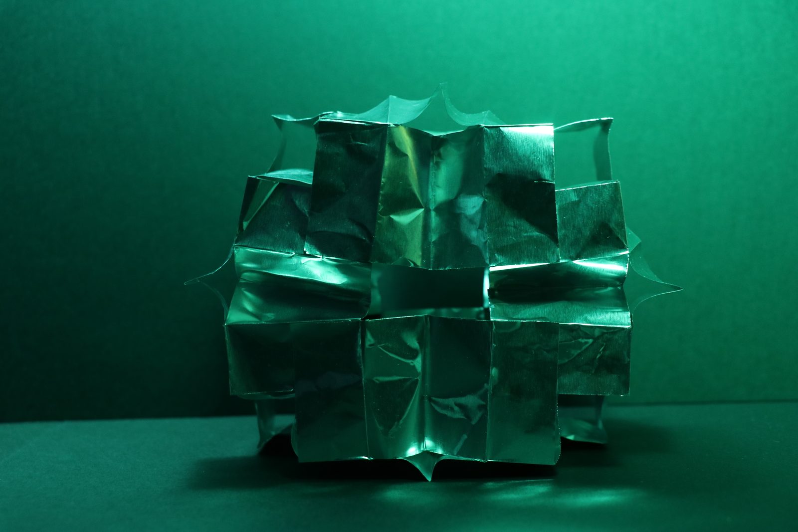
Folded paper form lit green on a green background.
Paper, green gel
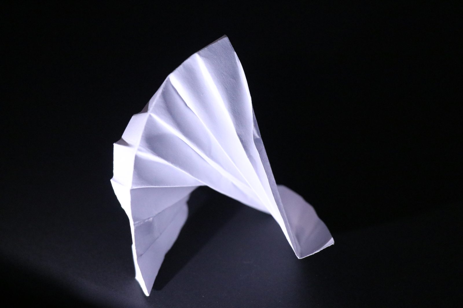
White folded paper fan in a pool of light on black.
Paper, single light
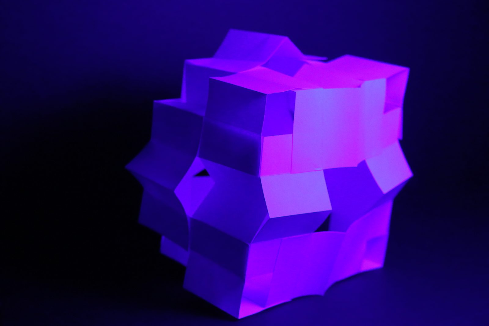
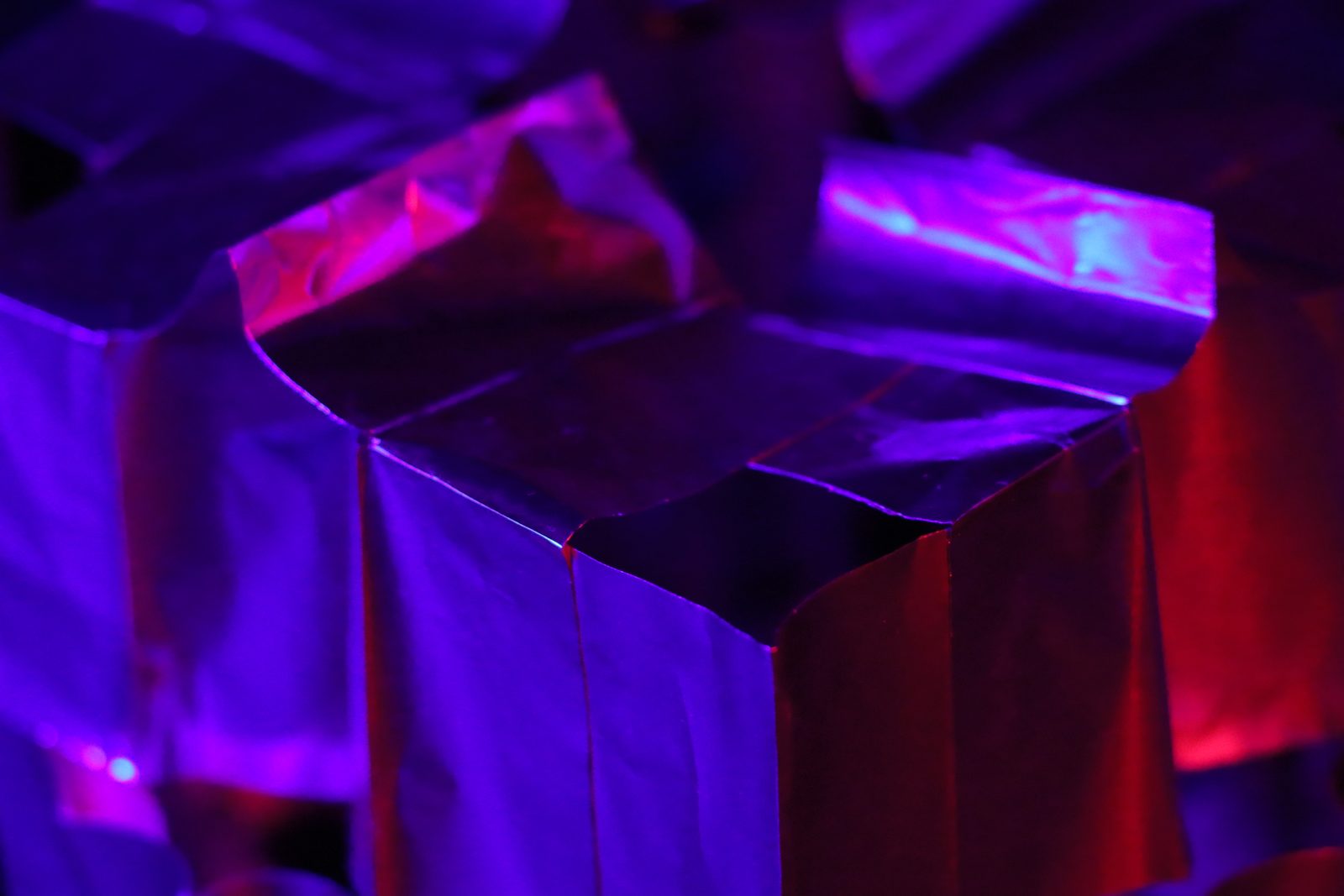
Close view of a folded paper cube lit in red and violet.
Paper, red and violet
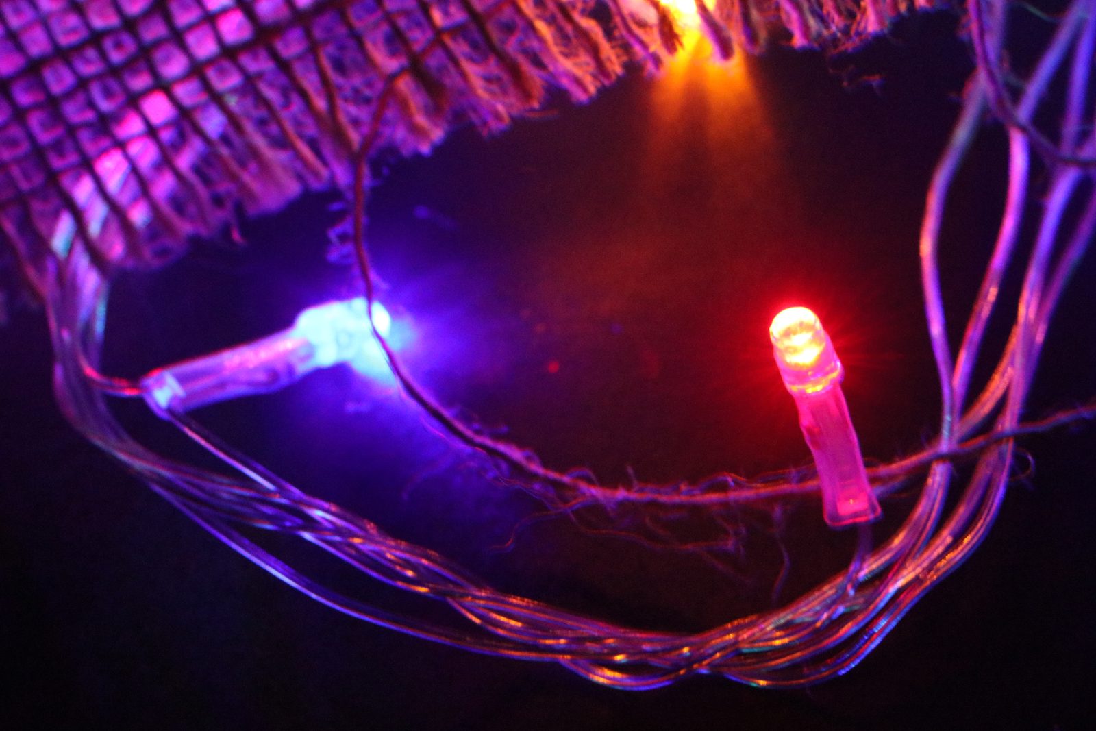
Fairy lights glowing red and blue through burlap.
Lights through burlap
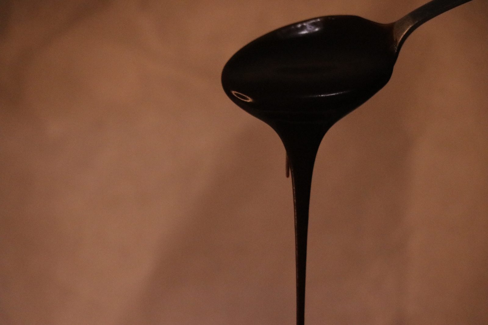
Melted chocolate dripping from a spoon against a warm brown background.
Chocolate, studio
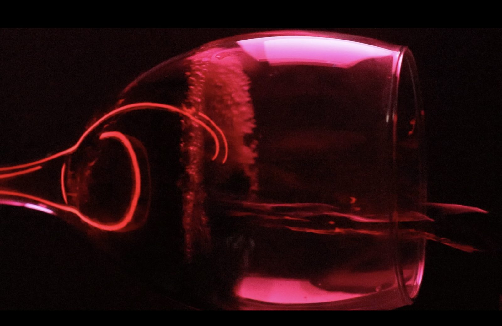
A wine glass lying on its side, lit pink and red against black.
Wine glass, red light
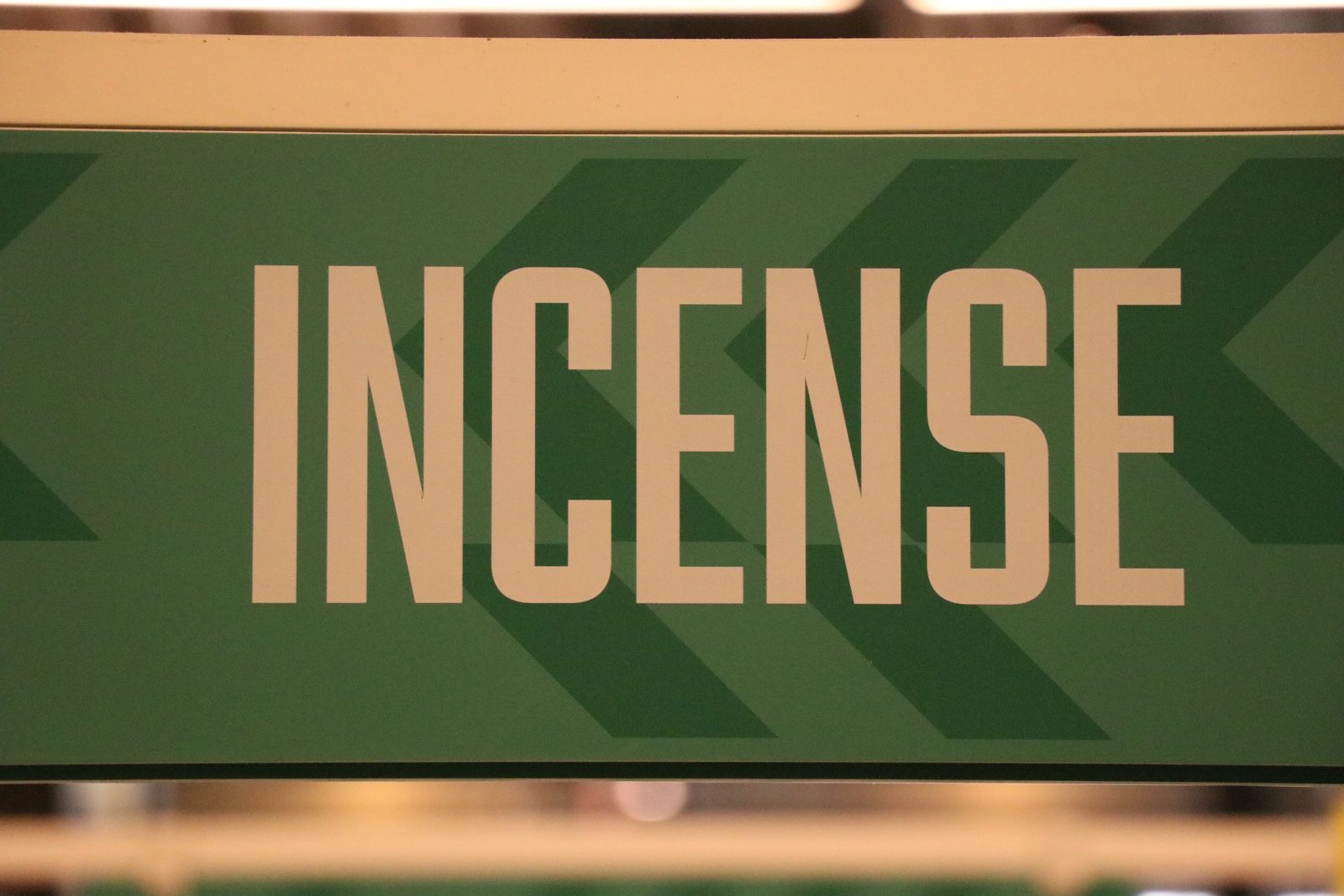
A green shop sign with the word INCENSE in tall cream letters.
Found type, Toronto

Printmaking, Tehran

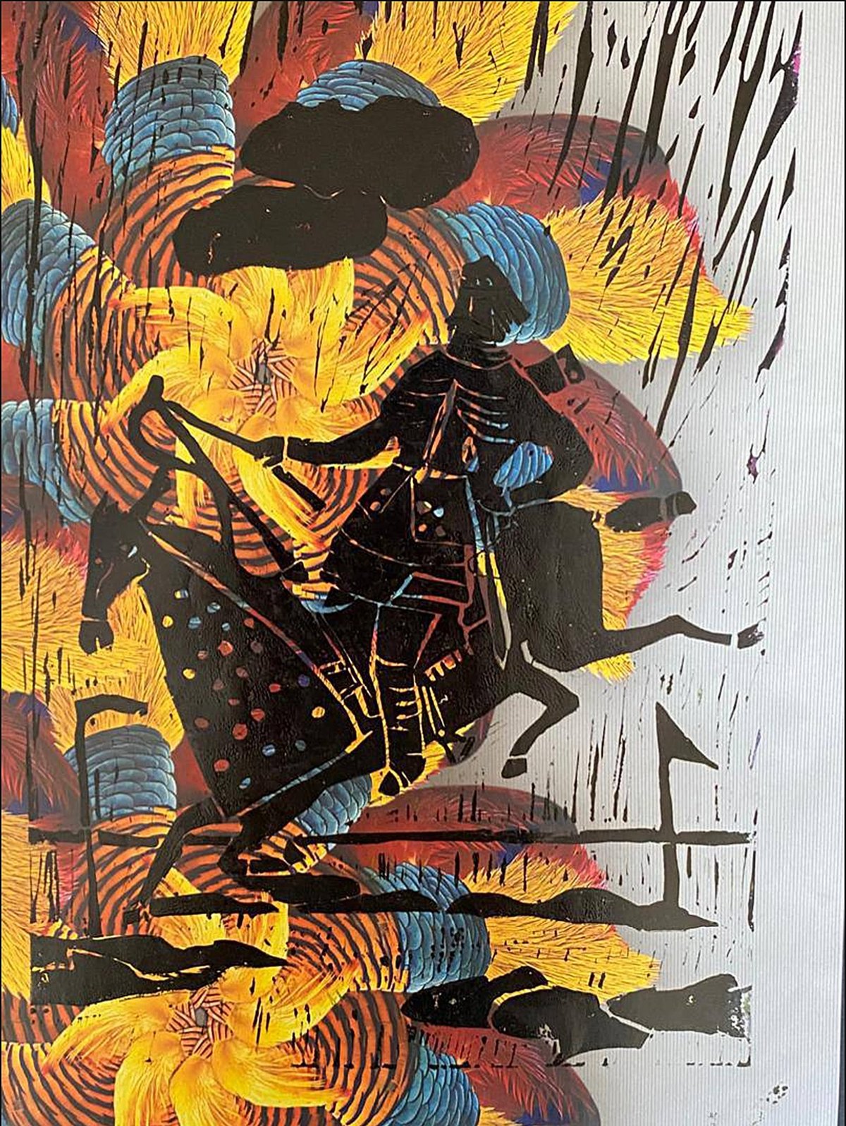
Linocut of a horse and rider in black over swirling yellow, orange and blue.
Linocut, 2017
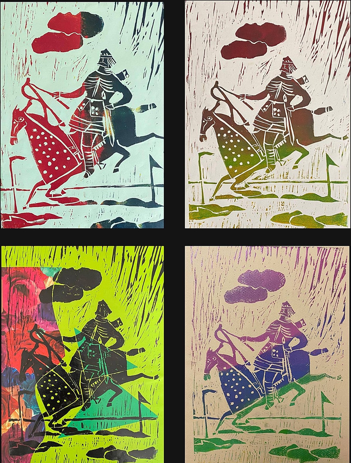
The same horse-and-rider linocut printed four times in different colour combinations.
The same linocut in four colourways
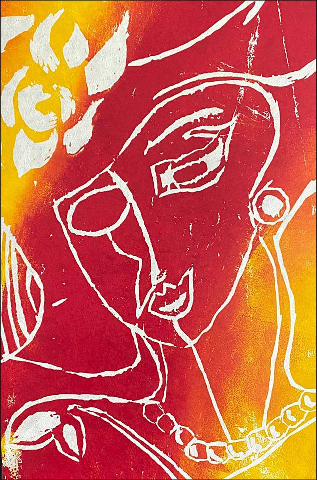
Woodcut of a face drawn in white lines over red, orange and yellow.
Woodcut, 2018
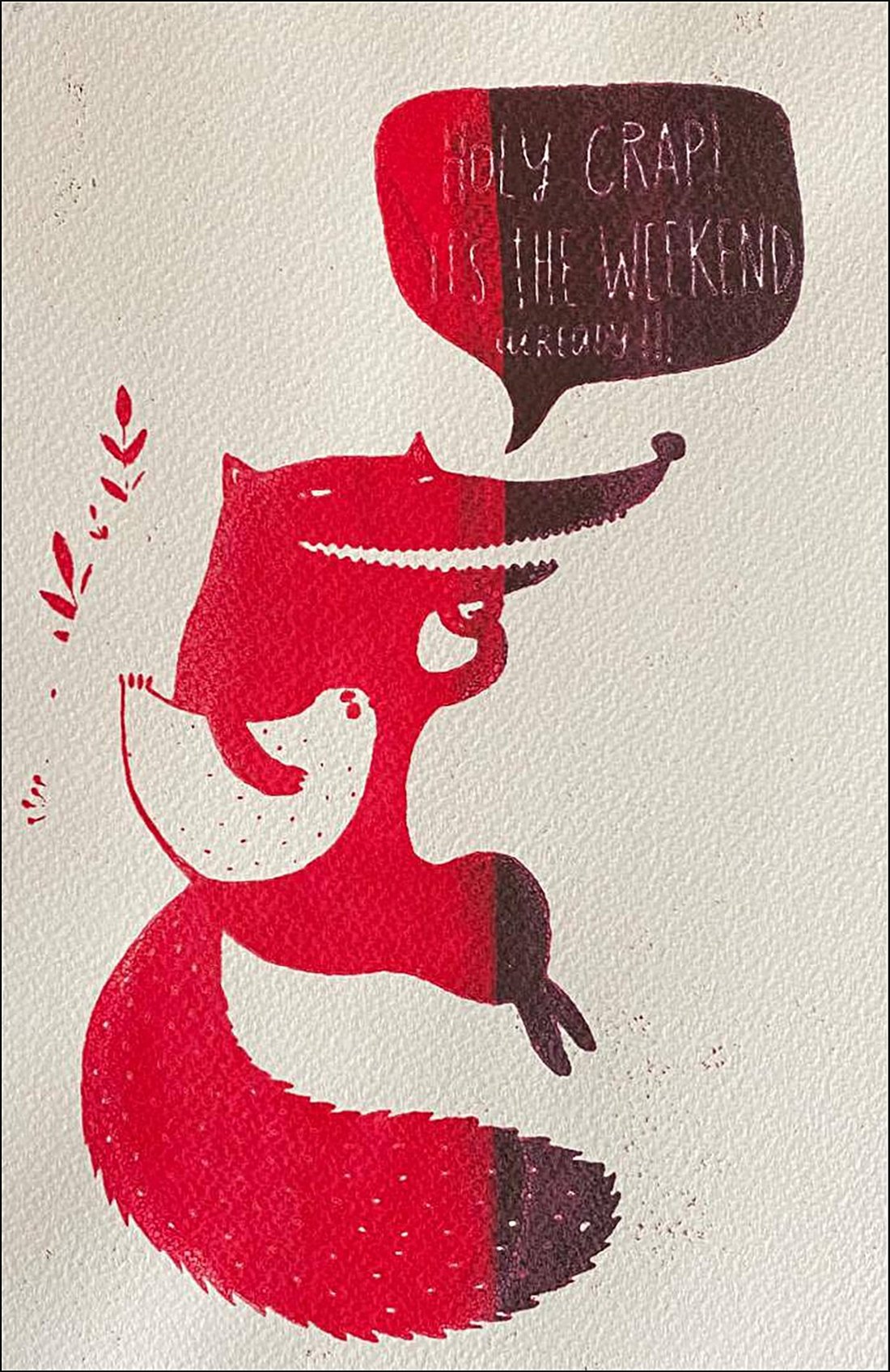
Screen print of a red fox with a speech bubble, on white paper.
Screen print, 2018

Painting and drawing

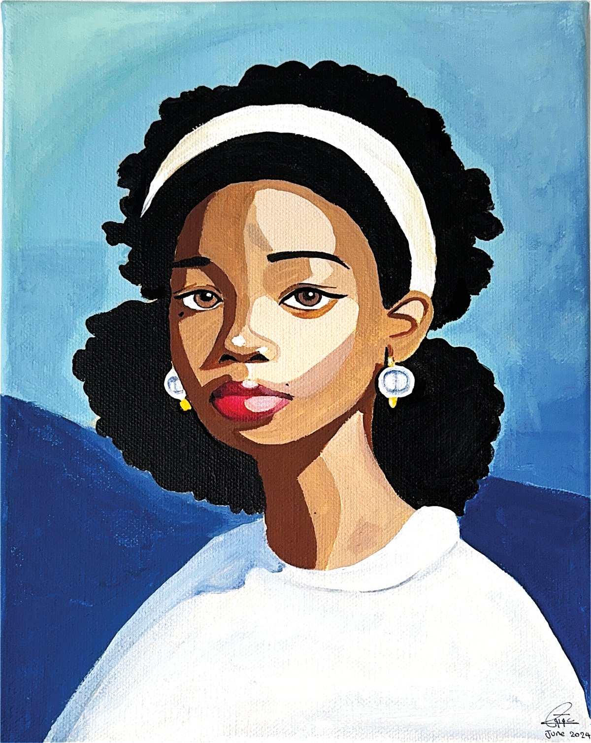
Acrylic portrait of a young woman with dark curly hair, a cream headband and pearl earrings, painted in flat planes of brown, white and two blues.
Portrait, acrylic on canvas, 2024
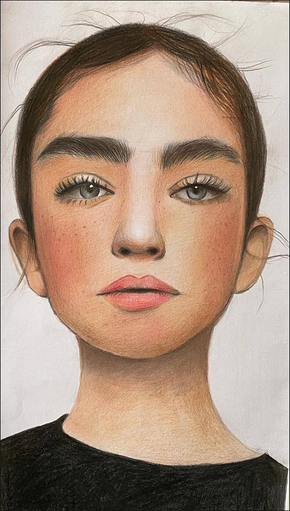
Realistic coloured pencil portrait of a young woman with dark eyebrows and hair pulled back.
Coloured pencil, Tehran, 2014

From the desk

Notes, swatches and test prints. Most of my projects start on paper before they reach the screen.

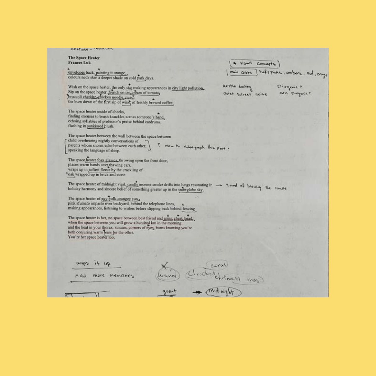
A printed copy of the poem The Space Heater covered in handwritten notes and arrows.
Notes on the poem, The Space Heater
First sheet of printed CMYK swatches in grey-blues, each labelled with its values.
First swatch sheet, Same Mistake
Final sheet of printed CMYK swatches moving from pale turquoise to deeper teal.
Final swatch sheet, Same Mistake
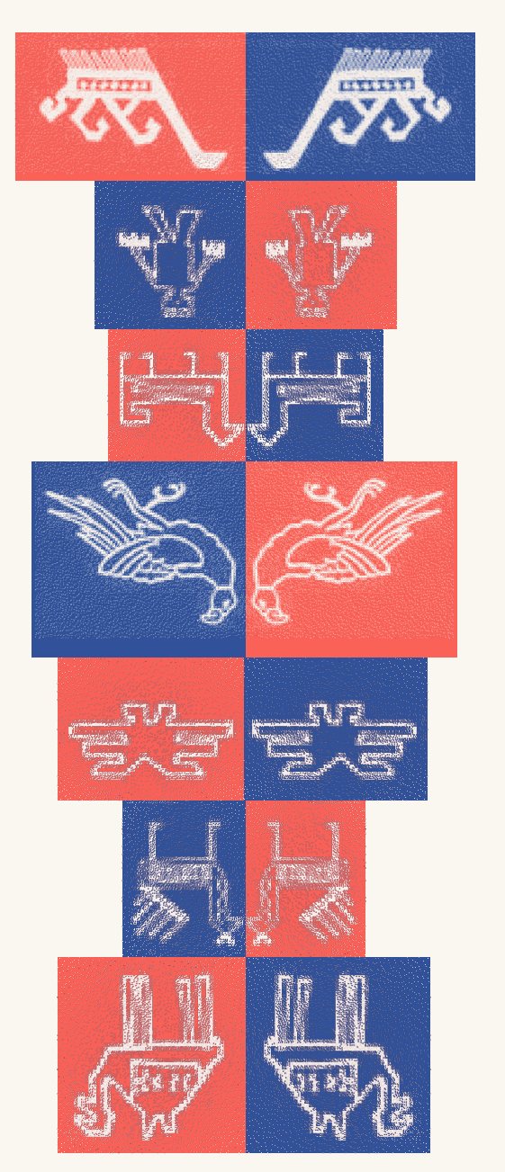
A column of red and blue rug-motif tiles: camels, birds and geometric figures.
Motif tiles, Woven Symbols
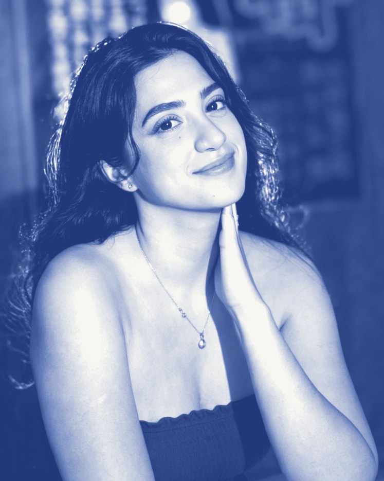
Portrait of Aqiq Gohari, toned in blue.
Toned in Riso Medium Blue.

About and contact

About

I design in Persian and English, by hand and on screen.

I’m a graphic design student at OCAD University in Toronto. I started in Tehran, where I earned a high-school diploma in graphic design and worked as a design intern.

My work has grown from linocut, woodcut and screen print to posters, logos, Persian type, risograph zines, kinetic type and short film. I shoot my own photos and footage, and I like carrying a project all the way to the finished, printed piece.

Outside class I’m always working on my own projects, from apps to paintings. I’m looking for an internship or a junior role in print, social or motion design.

Studying
Graphic Design, OCAD University
Before
High-school diploma in graphic design, Tehran
Experience
Graphic design intern, Noavaran High School, Tehran, summer 2018. Photography training and a mural for the school
Exhibited
Quilling and photography, Tehran, 2018
Languages
Persian (native), English
Tools
InDesign, Illustrator, Photoshop, After Effects, DSLR photo and video